
CSS吹き出しの作り方決定版!仕組みの図解&コピペできるデザイン9選
Webサイトを制作において、吹き出しを使って情報を目立たせたい場面は多いでしょう。CSSを使えば画像を使わなくても自在に吹き出しを作成できますが、どう実装するか悩ましいうえ、作るのに苦労する方も少なくありません。
この記事では、吹き出しが作れる仕組みを図解で丁寧に解説し、すぐに使えるデザイン例も9つご紹介します。
CSSで吹き出しが作れる仕組みとは?
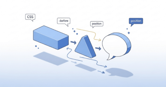
CSSで作る吹き出しは、実は仕組みは簡単です。基本となるのは「長方形のボックス」と「三角形」の2つの要素を組み合わせる方法です。
長方形は通常のdiv要素で作り、三角形はCSSの疑似要素を使って表現します。この2つを適切に配置することで、吹き出しらしい見た目が完成するのです。
次の章では、具体的な作成手順を順を追って解説していきます。
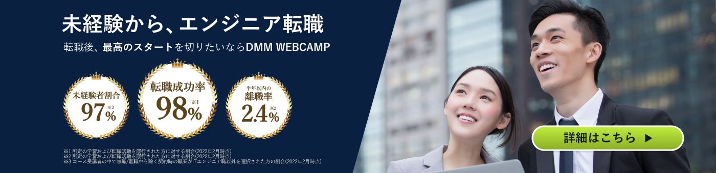
「なんか今の仕事合わないな・・・」
「IT業界に転職してみたいなぁ・・・」
という方、DMMが運営する「WEBCAMP エンジニア転職」をご検討してみてはいかがですか?

「WEBCAMP エンジニア転職」では最短12週間でITエンジニアを目指すことが可能です!
WEBCAMPの卒業生は転職後に年収もUP!(例:年収250万円→500万円)
しかも今なら受講料の最大70%が給付金として支給されます。
DMM WEBCAMPは経済産業省・厚生労働省が認定した専門実践教育訓練給付金制度の対象です
CSSでシンプルな吹き出しを作る方法
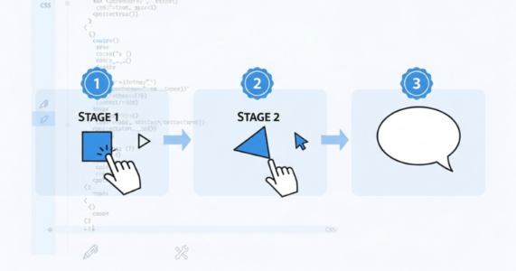
吹き出しの作成は、3つのステップに分けて進めると理解しやすくなります。まず長方形の本体ボックスを用意し、次にCSSのborderプロパティを使って三角形のパーツを作ります。
最後にこの2つを配置して組み合わせれば、吹き出しの完成です。コード例を交えながら順番に見ていきましょう。
①本体ボックスを作成する
まず、吹き出しの土台となる長方形のボックスから作っていきます。通常のdiv要素にCSSで幅と高さ、背景色を設定するだけで、吹き出しの本体部分ができあがります。
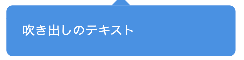
<div class="speech-balloon">吹き出しのテキスト</div>speech-balloon {
position: relative;
width: 250px;
padding: 20px;
background-color: #4a90e2;
color: #ffffff;
border-radius: 8px;
}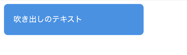
このコードでは、幅250pxの青い長方形ボックスを作っています。「padding」でテキストの周りに余白を設けることで、読みやすい吹き出しになります。
「border-radius」で角を少し丸めることで、より吹き出しらしい見た目になります。「position: relative」は、後ほど三角形を配置する際に必要になります。
②三角形を作成する
①で作った本体ボックスに、疑似要素の「::after」を使って三角形を追加します。HTMLはそのままで、CSSに以下のコードを追加するだけで完成です。
.speech-balloon::after {
  content: "";
  position: absolute;
  bottom: -24px;
  left: 50%;
  margin-left: -12px;
  width: 0;
  height: 0;
  border: 12px solid transparent;
  border-top: 12px solid #4a90e2;
}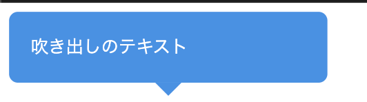
これは①のCSSに、「::after」の部分を追加しただけです。「::after」で②で学んだ三角形を作り、「position: absolute」で自由な位置に配置しています。
「bottom: -24px」で三角形をボックスの下側に移動させ、「left: 50%とmargin-left: -12px」の組み合わせで水平方向の中央に配置しています。こうして、典型的な吹き出しの形が完成します。
③組み合わせて位置を固定する
①と②を組み合わせた完成形のコードは以下になります。
<div class="speech-balloon">吹き出しのテキスト</div>.speech-balloon {
position: relative;
width: 250px;
padding: 20px;
background-color: #4a90e2;
color: #ffffff;
border-radius: 8px;
}
.speech-balloon::after {
content: "";
position: absolute;
bottom: -24px;
left: 50%;
margin-left: -12px;
width: 0;
height: 0;
border: 12px solid transparent;
border-top: 12px solid #4a90e2;
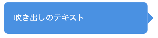
}矢印の方向を変える際は、「.speech-balloon::after」以降を、以下に変えてください。
左向き(右側に配置)の場合
.speech-balloon::after {
  content: "";
  position: absolute;
  top: 50%;
  right: -24px;
  margin-top: -12px;
  width: 0;
  height: 0;
  border: 12px solid transparent;
  border-left: 12px solid #4a90e2;
}
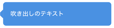
右向き(左側に配置)
.speech-balloon::after {
  content: "";
  position: absolute;
  top: 50%;
  left: -24px;
  margin-top: -12px;
  width: 0;
  height: 0;
  border: 12px solid transparent;
  border-right: 12px solid #4a90e2;
}
上向き(上部に配置)
.speech-balloon::after {
  content: "";
  position: absolute;
  top: -24px;
  left: 50%;
  margin-left: -12px;
  width: 0;
  height: 0;
  border: 12px solid transparent;
  border-bottom: 12px solid #4a90e2;
}
なお、以下の記事では、HTMLで図形を作る方法について解説しています。興味のある方はぜひ併せてお読みください。
【コピペあり】CSSの吹き出しデザイン例9選
ここからは、CSSの吹き出しデザイン例として、以下の9つを紹介します。
- ①四角い吹き出し
- ②角丸の吹き出し
- ③枠線付きの吹き出し
- ④円形の吹き出し
- ⑤考え中の吹き出し
- ⑥塗りつぶし・背景色のある吹き出し
- ⑦下線のみの吹き出し
- ⑧アイコン付きの吹き出し
- ⑨会話形式の吹き出し
シンプルな吹き出しデザイン
まずは、シンプルな吹き出しデザインを3つ紹介します。
①四角い吹き出し
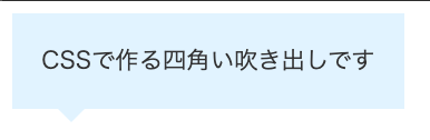
シンプルでもっとも簡単な吹き出しの例です。どんなサイトにも馴染むデザインで使いやすいのが特徴です。
コードは以下になります。
<div class="balloon-square">CSSで作る四角い吹き出しです</div>.balloon-square {
position: relative;
padding: 20px;
background-color: #e0f2ff;
color: #333;
}
.balloon-square::after {
content: "";
position: absolute;
bottom: -20px;
left: 30px;
width: 0;
height: 0;
border: 10px solid transparent;
border-top: 10px solid #e0f2ff;
}②角丸の吹き出し
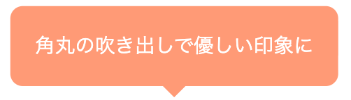
角丸デザインで、柔らかい印象を与えています。こちらも比較的どんなサイトにも馴染む王道デザインです。
コードは以下になります。
<div class="balloon-rounded">角丸の吹き出しで優しい印象に</div>.balloon-rounded {
position: relative;
display: inline-block;
padding: 20px;
background-color: #ff9a76;
color: #ffffff;
border-radius: 10px;
}
.balloon-rounded::after {
content: "";
position: absolute;
bottom: -20px;
left: 50%;
margin-left: -10px;
width: 0;
height: 0;
border: 10px solid transparent;
border-top: 10px solid #ff9a76;
}③枠線付きの吹き出し
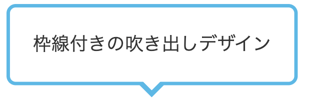
こちらは枠線付きの吹き出しデザイン例です。三角形にも枠線を表現するため、疑似要素を2つ使って三角形を重ね合わせる方法を使います。
コードは以下のようになります。
<div class="balloon-border">枠線付きの吹き出しデザイン</div>.balloon-border {
position: relative;
display: inline-block;
padding: 20px;
background-color: #ffffff;
color: #333;
border: 3px solid #5eb8e5;
border-radius: 8px;
}
.balloon-border::before {
content: "";
position: absolute;
bottom: -26px;
left: 50%;
margin-left: -13px;
width: 0;
height: 0;
border: 13px solid transparent;
border-top: 13px solid #5eb8e5;
}
.balloon-border::after {
content: "";
position: absolute;
bottom: -17px;
left: 50%;
margin-left: -10px;
width: 0;
height: 0;
border: 10px solid transparent;
border-top: 10px solid #ffffff;
}枠線付きの三角形を作るには、異なる色・サイズの三角形を2枚重ねます。まず「::before」で枠線と同じ色(#5eb8e5)の大きめの三角形を作り、次に「::after」で背景色(#ffffff)の少し小さい三角形を上に重ねます。
この2つを微妙にずらして配置することで、枠線があるように見せています。
おしゃれでかわいい吹き出しデザイン
ここでは、おしゃれでかわいい吹き出しデザインを4つ紹介します。
④円形の吹き出し
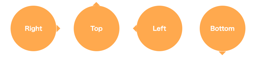
正円の吹き出しは、アイコンのように使えるデザインです。ワンポイントの強調や、数字の表示などに適しています。
コードは以下のようになります。
<div class="balloon-circle balloon-left">Right</div>
<div class="balloon-circle balloon-top">Top</div>
<div class="balloon-circle balloon-right">Left</div>
<div class="balloon-circle balloon-bottom">Bottom</div>
/* 円形吹き出しの基本スタイル */
.balloon-circle {
position: relative;
display: inline-block;
width: 120px;
height: 120px;
line-height: 120px;
text-align: center;
background-color: #ffa94d;
color: #ffffff;
font-weight: bold;
border-radius: 50%;
margin: 20px;
}
/* 左向き(右側に三角) */
.balloon-left::after {
content: "";
position: absolute;
right: -20px;
top: 50%;
margin-top: -10px;
width: 0;
height: 0;
border: 10px solid transparent;
border-left: 10px solid #ffa94d;
}
/* 上向き(上側に三角) */
.balloon-top::after {
content: "";
position: absolute;
top: -20px;
left: 50%;
margin-left: -10px;
width: 0;
height: 0;
border: 10px solid transparent;
border-bottom: 10px solid #ffa94d;
}
/* 右向き(左側に三角) */
.balloon-right::after {
content: "";
position: absolute;
left: -20px;
top: 50%;
margin-top: -10px;
width: 0;
height: 0;
border: 10px solid transparent;
border-right: 10px solid #ffa94d;
}
/* 下向き(下側に三角) */
.balloon-bottom::after {
content: "";
position: absolute;
bottom: -20px;
left: 50%;
margin-left: -10px;
width: 0;
height: 0;
border: 10px solid transparent;
border-top: 10px solid #ffa94d;
}⑤考え中の吹き出し
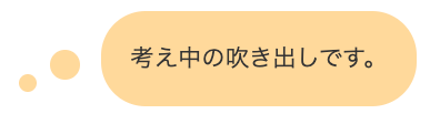
何かを考えているような雰囲気を演出できる吹き出しです。小さな円を複数並べることで、漫画でよく見る「考え中」の表現を再現しています。
補足情報や注釈を記載するときに使うと効果的で、読者に柔らかい印象を与えられます。コードは以下です。
<div class="balloon-thinking">考え中の吹き出しです。</div>.balloon-thinking {
position: relative;
display: inline-block;
max-width: 350px;
padding: 20px;
background-color: #ffd89b;
color: #333;
border-radius: 30px;
margin-left: 60px;
}
.balloon-thinking::before {
content: "";
position: absolute;
left: -40px;
bottom: 20px; /* 変更:吹き出しの下端近くに */
width: 20px;
height: 20px;
background-color: #ffd89b;
border-radius: 50%;
}
.balloon-thinking::after {
content: "";
position: absolute;
left: -55px; /* 変更:beforeよりさらに左に */
bottom: 10px; /* 変更:beforeより少し下に */
width: 12px;
height: 12px;
background-color: #ffd89b;
border-radius: 50%;
}⑥塗りつぶし・背景色のある吹き出し
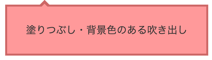
背景色をしっかりつけた吹き出しは視認性も高く、情報を目立たせたいときに最適です。三角形を上部に配置することで、見出しやタイトルとしても使えます。
コードは以下のようになります。
<div class="balloon-filled">塗りつぶし・背景色のある吹き出し</div>.balloon-filled {
position: relative;
display: inline-block;
max-width: 500px;
padding: 25px 30px;
background-color: #ff9999;
color: #333;
border: 3px solid #cc6666;
}
.balloon-filled::before {
content: "";
position: absolute;
top: -20px;
left: 50px;
width: 0;
height: 0;
border: 10px solid transparent;
border-bottom: 10px solid #cc6666;
}
.balloon-filled::after {
content: "";
position: absolute;
top: -14px;
left: 50px;
width: 0;
height: 0;
border: 10px solid transparent;
border-bottom: 10px solid #ff9999;
}⑦下線のみの吹き出し
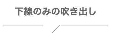
背景色を使わず、線だけで表現するミニマルな吹き出しです。余白の多いデザインや、モダンなWebサイトにマッチするスタイルです。
コードは以下のようになります。
<h2 class="balloon-stylish">
下線のみの吹き出し
<span></span>
</h2>
.balloon-stylish {
position: relative;
display: inline-block;
padding: 10px 30px;
padding-bottom: 35px;
color: #666;
text-align: center;
background-color: transparent;
}
.balloon-stylish::before {
content: "";
position: absolute;
bottom: 15px;
left: 0;
width: 38%;
height: 2px;
background-color: #999;
}
.balloon-stylish::after {
content: "";
position: absolute;
bottom: 15px;
right: 0;
width: 45%;
height: 2px;
background-color: #999;
}
.balloon-stylish span {
position: absolute;
bottom: 5px;
left: 45%;
margin-left: 0px;
width: 30px;
height: 1.5px;
background-color: #999;
transform: rotate(-45deg);
}SNS・チャット風の吹き出しデザイン
SNS・チャット風の吹き出しデザインを2つご紹介します。
⑧アイコン付きの吹き出し
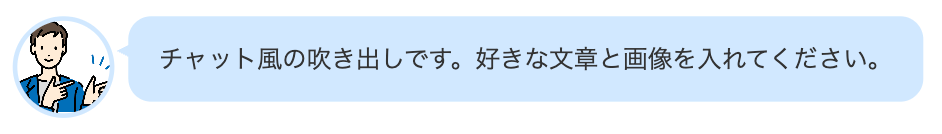
アイコン画像と吹き出しを組み合わせたデザインです。SNSやチャットアプリのような見た目になり、誰が発言しているのかが一目でわかります。
ブログの解説記事などで、キャラクターに補足説明をさせる際に効果的です。コードは以下のようになります。
<div class="chat-balloon">
  <div class="chat-icon">
    <img src="icon.jpg" alt="アイコン">
  </div>
  <div class="chat-text">
    <p>チャット風の吹き出しです。好きな文章と画像を入れてください。</p>
  </div>
</div>
.chat-balloon {
display: flex;
align-items: flex-start;
margin: 20px 0;
max-width: 600px;
}
.chat-icon {
flex-shrink: 0;
width: 60px;
height: 60px;
margin-right: 15px;
}
.chat-icon img {
width: 100%;
height: 100%;
border-radius: 50%;
border: 3px solid #d0e8ff;
object-fit: cover;
}
.chat-text {
position: relative;
padding: 15px 20px;
background-color: #d0e8ff;
border-radius: 15px;
max-width: 100%;
}
.chat-text::before {
content: "";
position: absolute;
top: 15px;
left: -15px; /* 変更:もっと左に */
width: 0;
height: 0;
border: 8px solid transparent; /* 変更:サイズ調整 */
border-right: 15px solid #d0e8ff; /* 変更:右側を大きく */
}
.chat-text p {
margin: 0;
color: #333;
line-height: 1.6;
}⑨会話形式の吹き出し
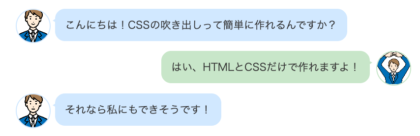
複数の吹き出しを左右交互に配置することで、2人以上の対話を表現できます。LINEやチャットアプリのような見た目になり、Q&A形式の解説や、キャラクター同士の会話を演出する際に効果的です。
左右で背景色を変えることで、誰の発言かがより明確になります。コードは以下のとおりです。
<div class="chat-conversation">
  <!-- 左側の吹き出し -->
  <div class="chat-left">
    <div class="chat-icon">
      <img src="icon1.jpg" alt="アイコン1">
    </div>
    <div class="chat-text-left">
      <p>こんにちは!CSSの吹き出しって簡単に作れるんですか?</p>
    </div>
  </div>

  <!-- 右側の吹き出し -->
  <div class="chat-right">
    <div class="chat-text-right">
      <p>はい、HTMLとCSSだけで作れますよ!</p>
    </div>
    <div class="chat-icon">
      <img src="icon2.jpg" alt="アイコン2">
    </div>
  </div>

  <!-- 左側の吹き出し -->
  <div class="chat-left">
    <div class="chat-icon">
      <img src="icon1.jpg" alt="アイコン1">
    </div>
    <div class="chat-text-left">
      <p>それなら私にもできそうです!</p>
    </div>
  </div>
</div>
.chat-conversation {
max-width: 600px;
margin: 20px auto;
}
/* 左側の吹き出し */
.chat-left {
display: flex;
align-items: flex-start;
margin-bottom: 15px;
}
.chat-left .chat-icon {
flex-shrink: 0;
width: 50px;
height: 50px;
margin-right: 10px;
}
.chat-left .chat-icon img {
width: 100%;
height: 100%;
border-radius: 50%;
border: 2px solid #d0e8ff;
object-fit: cover;
}
.chat-text-left {
position: relative;
padding: 12px 15px;
background-color: #d0e8ff;
border-radius: 15px;
max-width: 70%;
}
.chat-text-left::before {
content: "";
position: absolute;
top: 12px;
left: -10px;
width: 0;
height: 0;
border: 6px solid transparent;
border-right: 10px solid #d0e8ff;
}
.chat-text-left p {
margin: 0;
color: #333;
line-height: 1.6;
}
/* 右側の吹き出し */
.chat-right {
display: flex;
align-items: flex-start;
justify-content: flex-end;
margin-bottom: 15px;
}
.chat-right .chat-icon {
flex-shrink: 0;
width: 50px;
height: 50px;
margin-left: 10px;
}
.chat-right .chat-icon img {
width: 100%;
height: 100%;
border-radius: 50%;
border: 2px solid #c8e6c9;
object-fit: cover;
}
.chat-text-right {
position: relative;
padding: 12px 15px;
background-color: #c8e6c9;
border-radius: 15px;
max-width: 70%;
}
.chat-text-right::before {
content: "";
position: absolute;
top: 12px;
right: -10px;
width: 0;
height: 0;
border: 6px solid transparent;
border-left: 10px solid #c8e6c9;
}
.chat-text-right p {
margin: 0;
color: #333;
line-height: 1.6;
}ここまで、さまざまなデザインの吹き出しを紹介してきましたが、こうしたデザインを自力で生み出す知識を養うなら、プログラミングスクールで体系的に学ぶのも一つの手です。DMM WEBCAMPのWebデザインコースでは、CSSの基礎から実践的なデザインスキルまで、現役エンジニアのマンツーマン指導で習得できます。
さらに、経済産業省のリスキリング対象講座に認定されており、条件を満たせば最大70%、380,800円のキャッシュバックを受けられるのも大きな魅力です。本格的にWebデザインスキルを身につけたい方は、ぜひ検討してみてはいかがでしょうか。
>>DMM WEBCAMP Webデザインコースの詳細はこちら
まとめ
CSSで作る吹き出しデザインについて、基本の仕組みから応用デザインまで紹介してきました。長方形のボックスと三角形を組み合わせるというシンプルな構造ながら、borderプロパティや疑似要素を活用することで、多彩な表現が可能になります。
吹き出しのようなCSSテクニックをさらに深く学びたい方には、DMM WEBCAMPのフロントエンドコースがおすすめです。HTML/CSSはもちろん、JavaScriptやReactなどの最新技術まで、現役エンジニアのマンツーマン指導で実践的なスキルを習得できます。
また、経済産業省のリスキリング対象講座にも認定されており、条件を満たせば最大70%、213,054円のキャッシュバックが受けられます。フロントエンドエンジニアとしてのキャリアを目指す方は、ぜひご検討ください。