


【CSS】border-radiusを使ってやさしい角を作る方法
CSSのborderはブロックの囲み線を作るプロパティです。しかし、borderプロパティだけでは角が直角の四角しか表現できません。
そこで、今回はborderの角を丸くするCSSプロパティであるborder-radiusを紹介します。
border-radiusは角を丸くするだけでなく、ブロックを円にも変形できます。
border-radiusを使えるようになれば、表現の幅も広げることができ、オシャレなWebサイトを作成できます。
記事の後半では、円を作る方法も紹介しますので最後までご覧ください。
CSSで角を丸くするにはborder-radiusを使う
CSSで四角を丸くするにはborder-radiusプロパティを使用します。
radiusとは英語で半径という意味があり、border-radiusプロパティも半径も指定して角に丸みをつけます。
簡単なコード例を紹介します。
HTML
<div class="kadomaru">
    角丸を指定します
</div>
CSS
.kadomaru{
width: 200px;
height: 100px;
background-color: silver;
border-radius: 20px;
text-align: center;
line-height: 100px;
}
ここでは、border-radiusに20pxを指定しました。この時、四角が丸になる意味を下記の画像に示します。
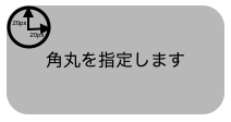
20pxの半径を持つ円を用いて、角を丸にしていることがわかります。border-radiusはこのような原理で角を丸にしています。
border-radiusプロパティで指定できる値
border-radiusプロパティで指定できる値は、pxだけではありません。
ここでは、border-radiusで指定できる値について解説します。
border-radiusプロパティで指定できる値は大きく分けて以下の2つになります。
- pxなどの絶対値
- %などの相対値
それぞれの角丸の形の決まり方を解説します。
pxなどの絶対値でradiusを指定
記事の前半でも述べたように、radiusをpxで指定した際には指定したpxの半径の円で角丸を作成します。
HTML
<div class="kadomaru">
    角丸を指定します
</div>
CSS
.kadomaru{
width: 200px;
height: 100px;
background-color: silver;
border-radius: 10px;
}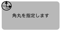
角の丸みを大きくしたいのであれば値を大きくすることで丸みは大きくなります。
CSS
.kadomaru{
  width: 200px;
  height: 100px;
  background-color: silver;
  border-radius: 50px;
}
%などの相対値でradiusを指定
border-radiusの値は%でも指定できます。
HTML
 <div class="kadomaru">
    角丸を指定します
</div>
CSS
.kadomaru{
width: 200px;
height: 100px;
background-color: silver;
border-radius: 20%;
}
%で指定した際の表示の仕方としては、上記のコードから例えると、横幅の20%から丸くなり始めるとともに縦幅の20%からも丸くなり始めるというような挙動をとります。
基準が横幅と縦幅の2つになるので正方形でない限り綺麗な丸角にならないことを理解しておきましょう。
border-radiusを用いて、円を描く
border-radiusの使い方が理解できたところで、円を描く方法を紹介します。
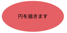
簡単なコード例を紹介します。
HTML
<div class="maru">
    円を描きます
</div>
CSS
.maru{
width: 150px;
height: 150px;
background-color: rgb(226, 111, 111);
border-radius: 50%;
}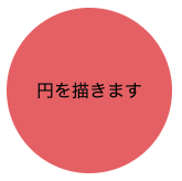
縦幅と横幅が等しいときにborder-radiusを50%にすることで綺麗な円を描くことができます。ちなみに、縦幅と横幅が等しく無いときは、少し潰れた円が描かれます。
CSS
.maru{
  width: 200px;
  height: 100px;
  background-color: rgb(226, 111, 111);
  border-radius: 50%;
}
CSSのborder-radiusで角を丸くする方法:まとめ
今回の記事では、border-radiusプロパティについて解説しました。
border-radiusは、ブロックの角を丸くする際に使われます。
オシャレなボタンを作成したり、画像を丸く表示したい時などに活躍するプロパティなので、習得必須のプロパティです。
指定できる値も理解した上で、思い通りの角丸を作れるようになりましょう。