


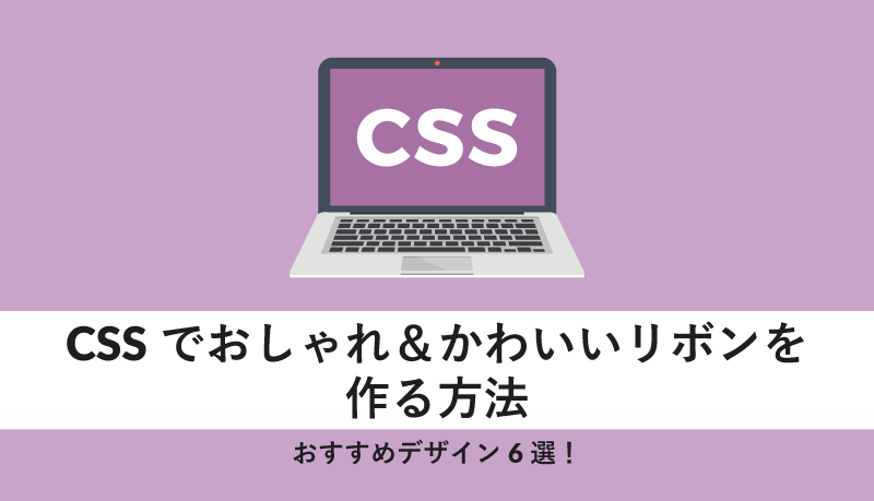
CSSでおしゃれ&かわいいリボンを作る方法|おすすめデザイン6選!
ファッション系や、女性向けなど、おしゃれなWebサイト制作において、CSSによる装飾は欠かせないもの。
全体の雰囲気や背景だけでなく、ボタンや見出しなどのアクセントとなる部分にもこだわると、よりオリジナリティのあるWebサイトになります。
そこで今回は、そんなWebサイトのアクセントになるパーツとして使いやすい「リボン」をCSSで作る方法と、おすすめデザインを6選紹介します。
この記事を読んでわかる内容は、以下の通りです。
- CSSでカットされたリボンを実装する方法
- CSSでリボンの折り目を実装する方法
「CSSでリボンを作りたい!」
「いろいろなリボンのデザインを見て参考にしたい」
などと思っている方は、ぜひ参考にしてくださいね。
CSSで作れるリボンデザイン6選!
CSSで実装できるリボンデザインを6選紹介していきます!
リボンの端をカットしているデザインや、折り目が付いているデザインなど、様々なタイプの実装方法を紹介しています。
自分のお気に入りのデザインを見つけて、挑戦してみてくださいね。
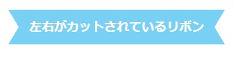
1.左右がカットされているリボン
<!-- HTMLコード -->
<h2>左右がカットされているリボン</h2>
/* CSSコード */
h2 {
display: inline-block;
position: relative;
height: 50px;
line-height: 50px;
text-align: center;
padding: 0 30px;
font-size: 18px;
background: #78d0f5;;
color: #FFF;
}
h2::before, h2::after {
position: absolute;
content: '';
width: 0px;
height: 0px;
z-index: 1;
}
h2::before {
top: 0;
left: 0;
border-width: 25px 0px 25px 15px;
border-color: transparent transparent transparent #fff;
border-style: solid;
}
h2::after {
top: 0;
right: 0;
border-width: 25px 15px 25px 0px;
border-color: transparent #fff transparent transparent;
border-style: solid;
}▼ブラウザ表示▼
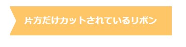
2.片方だけカットされているリボン
<!-- HTMLコード -->
<h2>片方だけカットされているリボン</h2>
/* CSSコード */
h2 {
display: inline-block;
position: relative;
height: 60px;
line-height: 60px;
text-align: center;
padding: 7px 0;
font-size: 18px;
background: #ffc668;
color: #FFF;
padding: 0 30px;
}
h2::before {
position: absolute;
content: '';
width: 0px;
height: 0px;
z-index: 1;
}
h2::before {
top: -2px;
left: -2px;
border-width: 32px 0px 32px 15px;
border-color: transparent transparent transparent #fff;
border-style: solid;
}▼ブラウザ表示▼
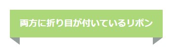
3.両方に折り目が付いているリボン
<!-- HTMLコード -->
<h2>両方に折り目が付いているリボン</h2>
/* CSSコード */
h2 {
display: inline-block;
position: relative;
padding: 15px 20px;
font-size: 18px;
color: #FFF;
background: #acd879;
}
h2::before {
position: absolute;
content: '';
top: 100%;
left: 0;
border: none;
border-bottom: solid 15px transparent;
border-right: solid 20px rgb(149, 158, 155);
}
h2::after {
position: absolute;
content: '';
top: 100%;
right: 0;
border: none;
border-bottom: solid 15px transparent;
border-left: solid 20px rgb(149, 158, 155);/*折り返し部分*/
}▼ブラウザ表示▼
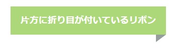
4.片方に折り目が付いているリボン
<!-- HTMLコード -->
<h2>片方に折り目が付いているリボン</h2>
/* CSSコード */
h2 {
display: inline-block;
position: relative;
padding: 15px 20px;
font-size: 18px;
color: #FFF;
background: #acd879;
}
h2::after {
position: absolute;
content: '';
top: 100%;
right: 0;
border: none;
border-bottom: solid 15px transparent;
border-left: solid 20px rgb(149, 158, 155);
}▼ブラウザ表示▼
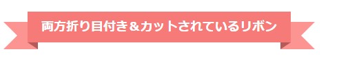
5.両方折り目付き&カットされているリボン
<!-- HTMLコード -->
<div class="ribbon">
  <h2>両方折り目付き&カットされているリボン</h2>
</div>
/* CSSコード */
.ribbon {
display: inline-block;
position: relative;
height: 45px;
text-align: center;
box-sizing: border-box;
}
.ribbon::before {
content: '';
position: absolute;
width: 10px;
bottom: -10px;
left: -35px;
z-index: -2;
border: 20px solid #fc9492;
border-left-color: transparent;
}
.ribbon::after {
content: '';
position: absolute;
width: 10px;
bottom: -10px;
right: -35px;
z-index: -2;
border: 20px solid #fc9492;
border-right-color: transparent;
}
.ribbon h2 {
display: inline-block;
position: relative;
margin: 0;
padding: 0 20px;
line-height: 45px;
font-size: 18px;
color: #FFF;
background: #f57a78;
}
.ribbon h2::before {
position: absolute;
content: '';
top: 100%;
left: 0;
border: none;
border-bottom: solid 10px transparent;
border-right: solid 15px #b65a59;
}
.ribbon h2::after {
position: absolute;
content: '';
top: 100%;
right: 0;
border: none;
border-bottom: solid 10px transparent;
border-left: solid 15px #b65a59;
}▼ブラウザ表示▼
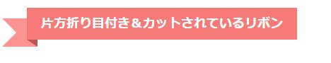
6.片方折り目付き&カットされているリボン
<!-- HTMLコード -->

<div class="ribbon">
  <h2>片方折り目付き&カットされているリボン</h2>
</div>
/* CSSコード */
.ribbon {
display: inline-block;
position: relative;
height: 45px;
text-align: center;
box-sizing: border-box;
}
.ribbon::before {
content: '';
position: absolute;
width: 10px;
bottom: -10px;
left: -35px;
z-index: -2;
border: 20px solid #fc9492;
border-left-color: transparent;
}
.ribbon h2 {
display: inline-block;
position: relative;
margin: 0;
padding: 0 20px;
line-height: 45px;
font-size: 18px;
color: #FFF;
background: #f57a78;
}
.ribbon h2::before {
position: absolute;
content: '';
top: 100%;
left: 0;
border: none;
border-bottom: solid 10px transparent;
border-right: solid 15px #b65a59;
}▼ブラウザ表示▼
色・形・模様までリボンのデザインは自由自在!CSSで自分だけのリボンを作ってみよう
今回は、おしゃれなWebサイトのアクセントなどに使えるリボンデザイン6選を紹介しました。
リボンデザインは、見出しやボックスデザインなどに利用できます。
今回ご紹介したリボンデザインをアレンジして、自分なりのリボンデザインを作ってみてくださいね。