
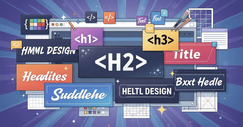
【HTML/CSS】見出しの基本ルールとおすすめデザイン50選を徹底解説!
Webサイトやブログを作るうえで、「見出し」は内容の理解しやすさや読みやすさを大きく左右するものです。
何気なく使っているh1やh2ですが、実はHTMLとしての正しい役割や、CSSでの見せ方を意識できていない方は多いのではないでしょうか。
本記事では、見出しタグの基本から使い分けの考え方、さらに実務で使いやすいおしゃれな見出しデザインまで、順を追って紹介していきます。
HTMLの見出しタグとは
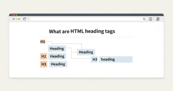
HTMLの見出しタグとは、ページ内の文章構造を示すために使われるh1からh6までのタグのことです。見出しタグを使うことで、どこからどこまでが同じ話題なのかを明確に区切れます。
その結果、ユーザーは内容を把握しやすくなり、流し読みもしやすくなります。また、検索エンジンに対してもページ構成を正しく伝えられるため、SEOの観点でも重要な役割を持ちます。
見出しタグは、文章の見た目を整えるためだけの装飾ではなく、情報を整理し伝えるための土台のような存在なのです。
以下の記事では、見出し・段落の付け方について解説しています。気になる方はぜひお読みください。
見出しタグの使用例
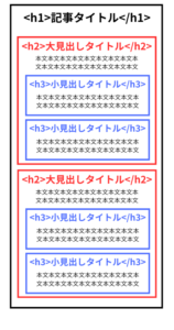
見出しタグは、文章の流れに合わせて階層的に使うのが基本です。
たとえば、ページ全体のテーマをh1で示し、その下に大きな話題としてh2を配置します。さらに、h2の内容を細かく説明したい場合にh3を使うと、情報の関係性が自然に伝わります。
図にすると、以下のようになります。
「なんか今の仕事合わないな・・・」
「IT業界に転職してみたいなぁ・・・」
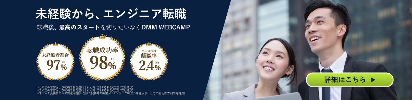
という方、DMMが運営する「WEBCAMP エンジニア転職」をご検討してみてはいかがですか?

「WEBCAMP エンジニア転職」では最短12週間でITエンジニアを目指すことが可能です!
WEBCAMPの卒業生は転職後に年収もUP!(例:年収250万円→500万円)
しかも今なら受講料の最大70%が給付金として支給されます。
DMM WEBCAMPは経済産業省・厚生労働省が認定した専門実践教育訓練給付金制度の対象です
HTMLの見出しタグ(h1~h6)の使い分け
ここでは、HTMLの見出しタグ(h1~h6)をどのように使い分けるべきかについて、詳しく解説していきます。
見出しタグの基本ルール
見出しタグには、「見出しとして内容を要約したテキストを記載する」のが基本です。本文の文章をそのまま入れたり、意味のない装飾目的で使ったりするのは適切とはいえません。
また、見出しタグの中にはテキストを入れるのが基本で、画像を配置する使い方は避ける必要があります。さらに、SEOを意識するあまりキーワードを不自然に詰め込みすぎると、かえって読みづらくなる原因になります。
h1の使い方
h1タグは、そのページや記事全体のテーマを示す最も重要な見出しです。そのため、基本的には1ページにつき1回のみ使用します。
主にサイトや記事のタイトルとして使われることが多く、内容を端的に表す役割があります。h1を複数使ってしまうと、ページの主題が分かりにくくなるため注意が必要です。
h1は構造の頂点に位置する見出しであることを意識して使いましょう。
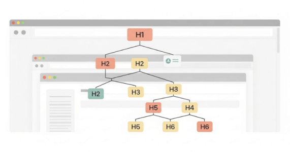
h2~h6の使い方
h2からh6の見出しタグは、必要に応じて何度使っても問題ありません。h1の下にh2、その下にh3というように、階層を順番に下げていくのが基本です。
h3の次にh2を使ったり、h2の直下にh4を置いたりする使い方は、構造が崩れるため避けたほうがいいでしょう。
また、フォントサイズやデザインだけで見出しレベルを選ぶのではなく、文章の意味的なまとまりを基準に判断することが重要です。
なお、タグの使い方については、以下の記事も参考になるので、ぜひご一読ください。
HTMLとCSSで作れるおしゃれな見出しデザイン50選
この章では、HTMLとCSSで作れるおしゃれな見出しデザインを、5つの項目にわけて50個解説していきます。
①シンプルな見出しデザイン
ここでは、シンプルな見出しデザインをご紹介します。
1.ボトムライン見出し
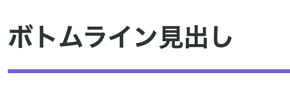
テキスト下部に太めのラインを配置し、見出しとコンテンツの境界を明確化しています。カラーはアクセントカラーとして機能します。
<h2 class="simple-heading-1">ボトムライン見出し</h2>【CSS】
.simple-heading-1 {
font-size: 26px;
font-weight: 600;
color: #2d3436;
padding-bottom: 14px;
border-bottom: 4px solid #6c5ce7;
}2.レフトアクセント見出し
左エッジに太いラインを設置することで、視線を自然に誘導しています。ミニマルながら存在感のあるデザインです。
<h2 class="simple-heading-2">レフトアクセント見出し</h2>.simple-heading-2 {
font-size: 26px;
font-weight: 600;
color: #2d3436;
padding-left: 18px;
border-left: 6px solid #fd79a8;
}3.ライトBG見出し
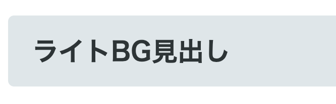
淡い背景カラーを敷くことで、テキストを浮き上がらせる効果を実現しています。読みやすさとデザイン性を両立させています。
<h2 class="simple-heading-3">ライトBG見出し</h2>.simple-heading-3 {
font-size: 26px;
font-weight: 600;
color: #2d3436;
padding: 16px 24px;
background-color: #dfe6e9;
border-radius: 6px;
}4.ダブルボーダー見出し
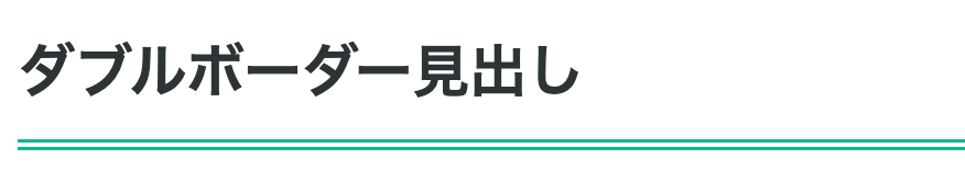
二重ボーダーを下部に配置することで、洗練された印象を演出しています。クラシカルなスタイルに適しています。
<h2 class="simple-heading-4">ダブルボーダー見出し</h2>.simple-heading-4 {
font-size: 26px;
font-weight: 600;
color: #2d3436;
padding-bottom: 12px;
border-bottom: 5px double #00b894;
}5.トップ&ボトムライン見出し
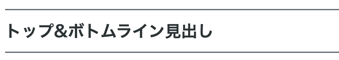
上下にラインを配置してテキストを挟んでいます。セクションの区切りとして効果的に機能するのが特徴です。
<h2 class="simple-heading-5">トップ&ボトムライン見出し</h2>.simple-heading-5 {
font-size: 26px;
font-weight: 600;
color: #2d3436;
padding: 14px 0;
border-top: 2px solid #636e72;
border-bottom: 2px solid #636e72;
}
6.フルボーダー見出し
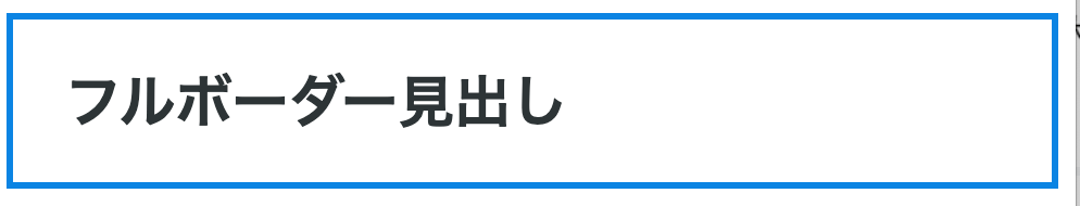
四辺すべてをボーダーで囲み、見出しをボックス要素として独立させています。情報の階層を視覚的に整理できます。
<h2 class="simple-heading-6">フルボーダー見出し</h2> .simple-heading-6 {
font-size: 26px;
font-weight: 600;
color: #2d3436;
padding: 18px 24px;
border: 3px solid #0984e3;
}7.ドットライン見出し
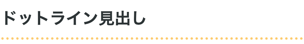
点線ボーダーを使用することで、柔らかく親しみやすい雰囲気を創出しています。カジュアルなトーンのコンテンツにマッチします。
<h2 class="simple-heading-7">ドットライン見出し</h2>.simple-heading-7 {
font-size: 26px;
font-weight: 600;
color: #2d3436;
padding-bottom: 12px;
border-bottom: 4px dotted #fdcb6e;
}8.インセットシャドウ見出し
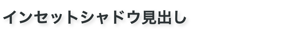
テキストに軽いドロップシャドウを適用し、奥行き感を付与しています。フラットデザインやシンプルデザインによく似合い、立体的なアクセントを加えてくれます。
<h2 class="simple-heading-8">インセットシャドウ見出し</h2>.simple-heading-8 {
font-size: 26px;
font-weight: 600;
color: #2d3436;
text-shadow: 3px 3px 6px rgba(0, 0, 0, 0.15);
}9.ダッシュボーダー見出し
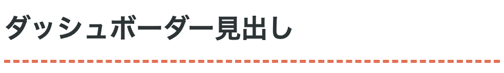
破線(dashed)を下部に配置し、ラフで手描き風の質感を演出。デザインに温かみを持たせたいときに有効です。
<h2 class="simple-heading-9">ダッシュボーダー見出し</h2>.simple-heading-9 {
font-size: 26px;
font-weight: 600;
color: #2d3436;
padding-bottom: 12px;
border-bottom: 3px dashed #e17055;
}10.サイドアクセント付きBG見出し
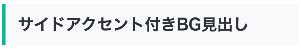
背景色と左側のバーティカルラインを組み合わせ、視認性を高めています。シンプルながら情報の階層が一目で分かります。
<h2 class="simple-heading-10">サイドアクセント付きBG見出し</h2>.simple-heading-10 {
font-size: 26px;
font-weight: 600;
color: #2d3436;
padding: 14px 20px;
background-color: #f8f9fa;
border-left: 6px solid #00b894;
border-radius: 0 4px 4px 0;
}②装飾的な見出しデザイン
ここでは、装飾的な見出しデザインとして、12個のデザインを紹介します。
1.シャドウカード見出し
ボックスシャドウで浮遊感を演出しています。カード型UIとして認識されやすく、モダンなWebデザインに適合します。
<h2 class="decorative-heading-1">シャドウカード見出し</h2>.decorative-heading-1 {
font-size: 26px;
font-weight: 600;
color: #2d3436;
padding: 18px 24px;
background-color: #ffffff;
border-radius: 8px;
box-shadow: 0 4px 12px rgba(0, 0, 0, 0.1);
}2.ネオングロー見出し

テキストシャドウを多重に適用し、発光エフェクトを再現しています。ダークモードやナイトテーマにぴったりです。
<h2 class="decorative-heading-2">ネオングロー見出し</h2>.decorative-heading-2 {
font-size: 26px;
font-weight: 700;
color: #00f5ff;
text-shadow: 0 0 10px #00f5ff, 0 0 20px #00f5ff, 0 0 30px #00f5ff;
background-color: #1a1a2e;
padding: 16px 24px;
border-radius: 6px;
}3.ダイアゴナルストライプ見出し
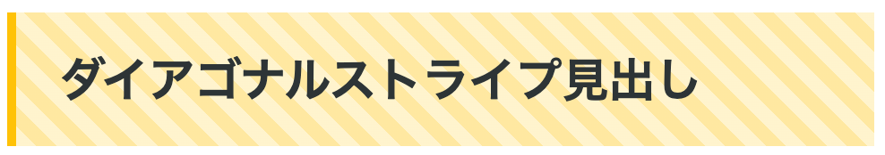
斜線パターンの背景を使用し、動的な視覚効果を出しています。方向性を持たせることで視線を誘導できます。
<h2 class="decorative-heading-3">ダイアゴナルストライプ見出し</h2>.decorative-heading-3 {
font-size: 26px;
font-weight: 600;
color: #2d3436;
padding: 18px 24px;
background: repeating-linear-gradient(
45deg,
#fff3cd,
#fff3cd 8px,
#ffe8a1 8px,
#ffe8a1 16px
);
border-left: 5px solid #ffc107;
}4.コーナーブラケット見出し

四隅にL字型の装飾を配置し、フォーカスエリアを明確化。シンプルながらも写真フレームのような上品さを表現できます。
<h2 class="decorative-heading-4">コーナーブラケット見出し</h2>.decorative-heading-4 {
font-size: 26px;
font-weight: 600;
color: #2d3436;
padding: 20px 28px;
position: relative;
margin: 20px 0;
}
.decorative-heading-4::before,
.decorative-heading-4::after {
content: '';
position: absolute;
width: 24px;
height: 24px;
}
.decorative-heading-4::before {
top: 0;
left: 0;
border-top: 3px solid #e74c3c;
border-left: 3px solid #e74c3c;
}
.decorative-heading-4::after {
bottom: 0;
right: 0;
border-bottom: 3px solid #e74c3c;
border-right: 3px solid #e74c3c;
}5.ツートンスプリット見出し

背景を2色に分割し、カラーコントラストで、サイトのテーマに合わせた個性が演出できます。上下で色を変えてもいいでしょう。
<h2 class="decorative-heading-5">ツートンスプリット見出し</h2>.decorative-heading-5 {
font-size: 26px;
font-weight: 600;
color: #ffffff;
padding: 18px 24px;
background: linear-gradient(90deg, #667eea 0%, #667eea 50%, #764ba2 50%, #764ba2 100%);
border-radius: 8px;
}6.台形ヘッダー見出し
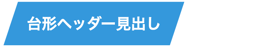
台形シェイプを採用し、ダイナミックな印象を創出。幾何学的なデザインでモダンさを強調します。
<h2 class="decorative-heading-7">台形ヘッダー見出し</h2>.decorative-heading-7 {
font-size: 26px;
font-weight: 600;
color: #ffffff;
padding: 18px 40px;
background-color: #3498db;
clip-path: polygon(8% 0%, 100% 0%, 92% 100%, 0% 100%);
display: inline-block;
}7.エンボステキスト見出し
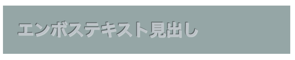
テキストに凹凸効果を施し、彫刻のような質感を再現しています。趣の強いサイトから、色味を変えればラグジュアリーなブランディングにも使えます。
<h2 class="decorative-heading-8">エンボステキスト見出し</h2>.decorative-heading-8 {
font-size: 28px;
font-weight: 700;
color: #bdc3c7;
background-color: #95a5a6;
padding: 20px 24px;
text-shadow: 1px 1px 1px rgba(255, 255, 255, 0.5),
-1px -1px 1px rgba(0, 0, 0, 0.5);
}8.パンチホール風見出し
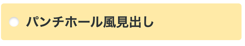
疑似要素で円形の装飾を配置し、紙に穴を開けたようなビジュアルとなっています。ユニークで記憶に残りやすいデザインです。
<h2 class="decorative-heading-9">パンチホール風見出し</h2>.decorative-heading-9 {
font-size: 26px;
font-weight: 600;
color: #2d3436;
padding: 18px 24px 18px 50px;
background-color: #ffeaa7;
position: relative;
border-radius: 6px;
}
.decorative-heading-9::before {
content: '';
position: absolute;
left: 16px;
top: 50%;
transform: translateY(-50%);
width: 20px;
height: 20px;
background-color: #ffffff;
border-radius: 50%;
box-shadow: inset 0 2px 4px rgba(0, 0, 0, 0.2);
}9.マルチボーダー見出し
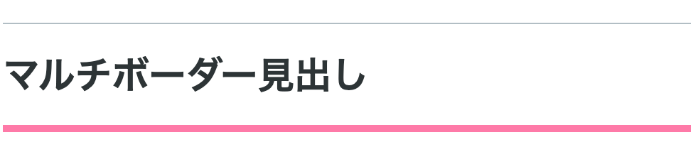
上下に異なる太さのボーダーを配置し、デザイン性を強調しています。上下両方に同じ装飾を施すと、主張が強くなりすぎる場合などに使えるデザインです。
<h2 class="decorative-heading-10">マルチボーダー見出し</h2>.decorative-heading-10 {
font-size: 26px;
font-weight: 600;
color: #2d3436;
padding: 16px 0;
border-top: 1px solid #b2bec3;
border-bottom: 5px solid #fd79a8;
}10.ジグザグボーダー見出し
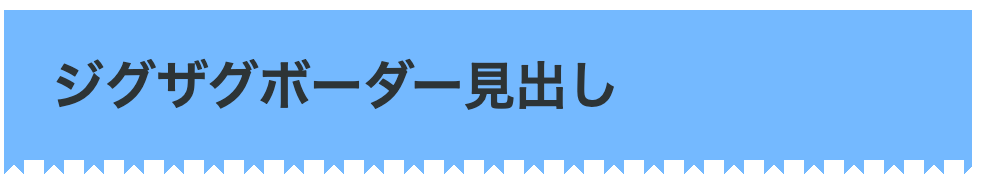
ギザギザパターンの装飾ラインを追加し、ポップでエネルギッシュな雰囲気に仕上がっています。カジュアルで若年層向けのコンテンツによく似合います。
<h2 class="decorative-heading-11">ジグザグボーダー見出し</h2>.decorative-heading-11 {
font-size: 26px;
font-weight: 600;
color: #2d3436;
padding: 18px 24px;
background-color: #74b9ff;
position: relative;
}
.decorative-heading-11::after {
content: '';
position: absolute;
bottom: -10px;
left: 0;
width: 100%;
height: 10px;
background: linear-gradient(135deg, #74b9ff 25%, transparent 25%),
linear-gradient(225deg, #74b9ff 25%, transparent 25%);
background-size: 20px 10px;
background-position: 0 0, 10px 0;
background-repeat: repeat-x;
}11.アウトラインテキスト見出し
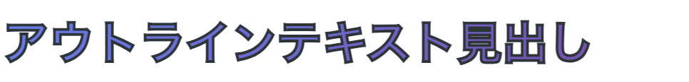
あえて周りではなく、文字を中抜きにして輪郭のみ表示しています。背景が透けるデザインにもできるので、グラフィカルかつ印象的なビジュアルを実現できます。
<h2 class="decorative-heading-12">アウトラインテキスト見出し</h2>.decorative-heading-12 {
font-size: 32px;
font-weight: 900;
color: transparent;
-webkit-text-stroke: 2px #2d3436;
text-stroke: 2px #2d3436;
padding: 14px 0;
background: linear-gradient(135deg, #667eea 0%, #764ba2 100%);
-webkit-background-clip: text;
background-clip: text;
}12.二段ボックス見出し
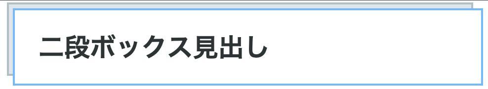
背景ボックスを二重に重ねることで奥行きを表現。レイヤー構造により、視覚的な立体感と存在感を創出します。
<h2 class="decorative-heading-6">二段ボックス見出し</h2>.decorative-heading-6 {
font-size: 26px;
font-weight: 600;
color: #2d3436;
padding: 18px 24px;
background-color: #ffffff;
border: 2px solid #74b9ff;
position: relative;
margin-left: 8px;
margin-top: 8px;
}
.decorative-heading-6::before {
content: '';
position: absolute;
top: -8px;
left: -8px;
right: 8px;
bottom: 8px;
background-color: #dfe6e9;
border: 2px solid #b2bec3;
z-index: -1;
}③可愛い見出しデザイン
この章では、可愛い見出しデザインパターンを10個紹介します。
1.ふんわりパステル見出し
淡いパステルカラーと丸みを帯びた角で、優しく柔らかい印象となっています。女性向けコンテンツやライフスタイル系サイトに最適です。
<h2 class="cute-heading-1">ふんわりパステル見出し</h2>.cute-heading-1 {
font-size: 26px;
font-weight: 600;
color: #ff9ff3;
padding: 20px 28px;
background-color: #ffeef8;
border-radius: 20px;
border: 3px solid #ffc2e8;
}2.ドットボーダー見出し
上下に小さなドット模様を配置し、手描き風の可愛らしさを表現しています。カジュアルでポップな雰囲気にぴったりです。
<h2 class="cute-heading-2">ドットボーダー見出し</h2>.cute-heading-2 {
font-size: 26px;
font-weight: 600;
color: #2d3436;
padding: 16px 0;
background-image:
radial-gradient(circle, #ff6b9d 2px, transparent 2px),
radial-gradient(circle, #ff6b9d 2px, transparent 2px);
background-size: 15px 15px;
background-position: 0 0, 0 100%;
background-repeat: repeat-x;
}3.ハート付き見出し
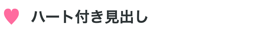
左側にハート型の装飾を配置し、シンプルながらキュートで愛らしい雰囲気です。記念日やイベント告知に効果的です。
<h2 class="cute-heading-3">ハート付き見出し</h2>.cute-heading-3 {
font-size: 26px;
font-weight: 600;
color: #2d3436;
padding-left: 50px;
position: relative;
}
.cute-heading-3::before {
content: '♥';
position: absolute;
left: 0;
top: 50%;
transform: translateY(-50%);
font-size: 32px;
color: #ff6b9d;
}4.クラウド吹き出し見出し
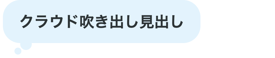
雲のような丸みのある吹き出し形状で、お悩み相談系、睡眠系、子供向けコンテンツなどにもマッチします。
<h2 class="cute-heading-4">クラウド吹き出し見出し</h2>.cute-heading-4 {
font-size: 26px;
font-weight: 600;
color: #2d3436;
padding: 18px 28px;
background-color: #e3f2fd;
border-radius: 30px;
position: relative;
display: inline-block;
}
.cute-heading-4::before {
content: '';
position: absolute;
bottom: -12px;
left: 30px;
width: 20px;
height: 20px;
background-color: #e3f2fd;
border-radius: 50%;
}
.cute-heading-4::after {
content: '';
position: absolute;
bottom: -20px;
left: 20px;
width: 12px;
height: 12px;
background-color: #e3f2fd;
border-radius: 50%;
}5.キャンディストライプ見出し
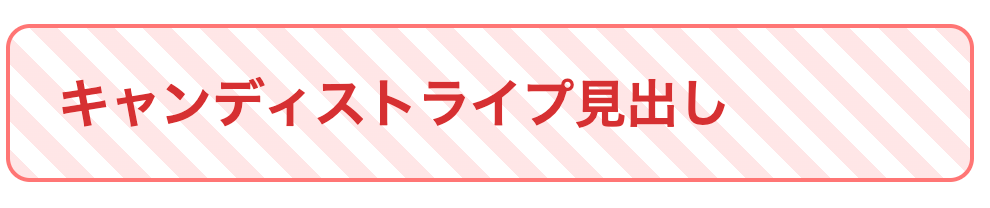
細めのストライプパターンでキャンディのような雰囲気です。ポップで楽しげな印象を与えます。
<h2 class="cute-heading-5">キャンディストライプ見出し</h2>.cute-heading-5 {
font-size: 26px;
font-weight: 600;
color: #d63031;
padding: 18px 24px;
background: repeating-linear-gradient(
45deg,
#ffe6e6,
#ffe6e6 10px,
#ffffff 10px,
#ffffff 20px
);
border-radius: 12px;
border: 2px solid #ff7675;
}6.リボンタグ見出し

リボンのような形状を採用し、ギフトやプレゼントを連想させる華やかさと特別感を演出できます。
<h2 class="cute-heading-6">リボンタグ見出し</h2>.cute-heading-6 {
font-size: 26px;
font-weight: 600;
color: #ffffff;
padding: 16px 28px 16px 20px;
background-color: #fd79a8;
position: relative;
display: inline-block;
border-radius: 0 8px 8px 0;
}
.cute-heading-6::before {
content: '';
position: absolute;
left: 0;
top: 0;
width: 0;
height: 0;
border-style: solid;
border-width: 28px 0 28px 15px;
border-color: transparent transparent transparent #ffffff;
}
.cute-heading-6::after {
content: '';
position: absolute;
right: -12px;
top: 0;
width: 0;
height: 0;
border-style: solid;
border-width: 28px 0 28px 12px;
border-color: #fd79a8 transparent #fd79a8 #fd79a8;
}7.グミボタン見出し
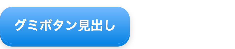
グミキャンディのようなぷっくりとした立体感を表現しています。ボックスシャドウとグラデーションで質感を再現します。
<h2 class="cute-heading-9">グミボタン見出し</h2>.cute-heading-9 {
font-size: 26px;
font-weight: 600;
color: #ffffff;
padding: 18px 28px;
background: linear-gradient(180deg, #74b9ff 0%, #0984e3 100%);
border-radius: 25px;
box-shadow: 0 6px 0 #0984e3, 0 8px 12px rgba(0, 0, 0, 0.2);
display: inline-block;
}8.お花デコ見出し
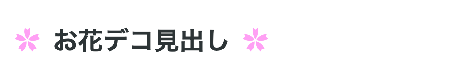
左右に小さな花型装飾を配置し、ガーリーで華やかな雰囲気を創出。春らしさや女性らしさを表現できます。
<h2 class="cute-heading-10">お花デコ見出し</h2>.cute-heading-10 {
font-size: 26px;
font-weight: 600;
color: #2d3436;
padding: 0 50px;
position: relative;
display: inline-block;
}
.cute-heading-10::before,
.cute-heading-10::after {
content: '✿';
position: absolute;
top: 50%;
transform: translateY(-50%);
font-size: 28px;
color: #ff9ff3;
}
.cute-heading-10::before {
left: 10px;
}
.cute-heading-10::after {
right: 10px;
}9.スカラップフレーム見出し
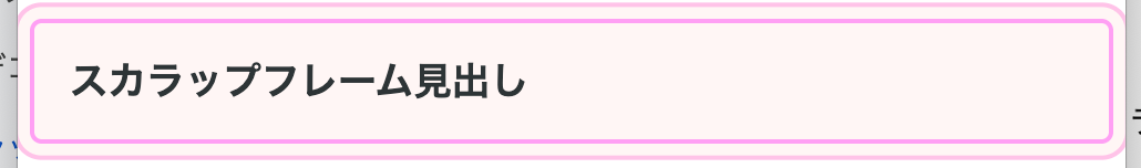
二重の縁取りで、レースやドイリーのような繊細な可愛らしさを演出しています。フェミニンで優しい印象を与えます。
<h2 class="cute-heading-7">スカラップフレーム見出し</h2>.cute-heading-7 {
font-size: 26px;
font-weight: 600;
color: #2d3436;
padding: 20px 24px;
background-color: #fff5f5;
border: 3px solid #ff9ff3;
border-radius: 8px;
box-shadow:
0 0 0 8px #fff5f5,
0 0 0 11px #ffc2e8;
}10.ぷくぷくバブル見出し
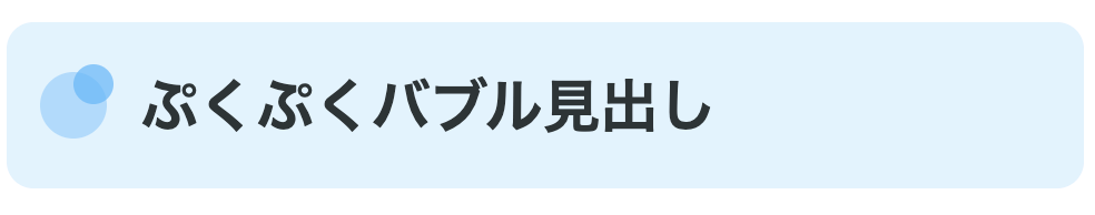
バブル(泡)が浮かんでいるようなデザインで軽やかで遊び心のある雰囲気を演出し、楽しげな印象を与えます。
<h2 class="cute-heading-8">ぷくぷくバブル見出し</h2>.cute-heading-8 {
font-size: 26px;
font-weight: 600;
color: #2d3436;
padding: 18px 24px 18px 60px;
background-color: #e3f2fd;
border-radius: 12px;
position: relative;
}
.cute-heading-8::before {
content: '';
position: absolute;
left: 15px;
top: 50%;
transform: translateY(-50%);
width: 30px;
height: 30px;
background-color: #90caf9;
border-radius: 50%;
opacity: 0.6;
}
.cute-heading-8::after {
content: '';
position: absolute;
left: 30px;
top: 25%;
width: 18px;
height: 18px;
background-color: #64b5f6;
border-radius: 50%;
opacity: 0.7;
}④スタイリッシュな見出しデザイン
ここからは、スタイリッシュな見出しデザインを紹介します。
1. モノクロミニマル見出し
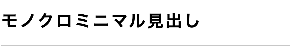
黒と白のコントラストのみで構成し、無駄を削ぎ落としました。洗練されたモダンな雰囲気を演出できます。
<h2 class="stylish-heading-1">モノクロミニマル見出し</h2>.stylish-heading-1 {
font-size: 28px;
font-weight: 700;
color: #000000;
padding: 20px 0;
border-bottom: 1px solid #000000;
letter-spacing: 0.1em;
}2. グローライン見出し
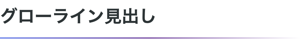
下部にグラデーションの細いラインを配置し、光が流れるような効果を表現しています。先進的で未来的な印象を与えます。
<h2 class="stylish-heading-2">グローライン見出し</h2>.stylish-heading-2 {
font-size: 28px;
font-weight: 700;
color: #2d3436;
padding-bottom: 16px;
position: relative;
}
.stylish-heading-2::after {
content: '';
position: absolute;
bottom: 0;
left: 0;
width: 100%;
height: 2px;
background: linear-gradient(90deg, #667eea 0%, #764ba2 50%, transparent 100%);
}3. アシンメトリックボーダー見出し
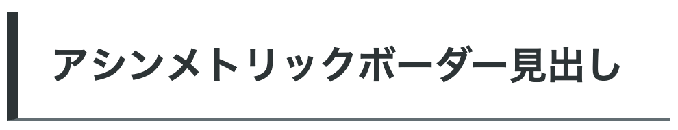
左右非対称の太さを持つボーダーで構成し、動きと個性を演出しています。アート性の高いデザインに適合します。
<h2 class="stylish-heading-3">アシンメトリックボーダー見出し</h2>.stylish-heading-3 {
font-size: 28px;
font-weight: 700;
color: #2d3436;
padding: 18px 0 18px 24px;
border-left: 8px solid #2d3436;
border-bottom: 2px solid #636e72;
}4. ネガティブスペース見出し
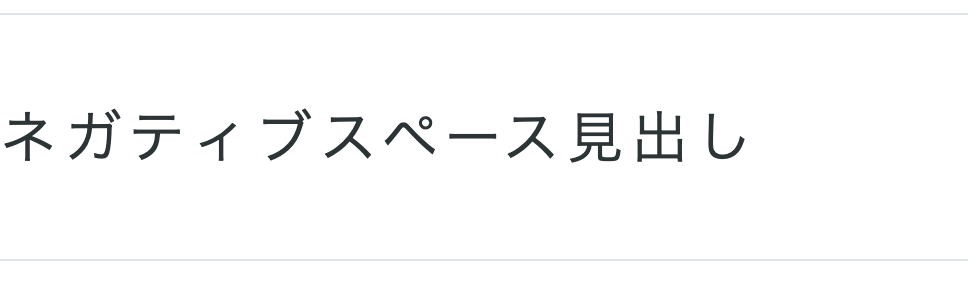
余白を大胆に活用し、テキストの存在感を際立たせています。ミニマルで知的な印象を与えます。
<h2 class="stylish-heading-6">ネガティブスペース見出し</h2>.stylish-heading-6 {
font-size: 28px;
font-weight: 300;
color: #2d3436;
padding: 40px 0;
border-top: 1px solid #dfe6e9;
border-bottom: 1px solid #dfe6e9;
letter-spacing: 0.15em;
}5.ディープシャドウ見出し
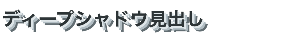
深い影を配置し、立体感と重厚感を表現しています。力強く印象的なビジュアルを実現します。
<h2 class="stylish-heading-9">ディープシャドウ見出し</h2>.stylish-heading-9 {
font-size: 32px;
font-weight: 900;
color: #2d3436;
text-shadow:
3px 3px 0 #dfe6e9,
6px 6px 0 #b2bec3,
9px 9px 0 #636e72;
padding: 14px 0;
}6. アンダースコアタイポ見出し
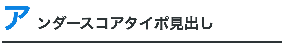
一文字目を特大サイズにし、視覚的なインパクトを創出しています。雑誌的でエディトリアルな雰囲気を演出します。
<h2 class="stylish-heading-10"><span class="first-char">ア</span>ンダースコアタイポ見出し</h2>.stylish-heading-10 {
font-size: 26px;
font-weight: 700;
color: #2d3436;
padding-bottom: 12px;
border-bottom: 3px solid #2d3436;
}
.stylish-heading-10 .first-char {
font-size: 52px;
font-weight: 900;
line-height: 0.8;
margin-right: 8px;
color: #0984e3;
}7.タイプライター見出し
等幅フォントとアンダースコアを組み合わせ、タイプライターで打ち込んだような機械的な美しさを表現しています。テック系やレトロフューチャーなデザインに適合します。
<h2 class="stylish-heading-4">タイプライター見出し_</h2>.stylish-heading-4 {
font-size: 28px;
font-weight: 700;
color: #2d3436;
font-family: 'Courier New', monospace;
padding: 18px 24px;
background-color: #f8f9fa;
border-left: 4px solid #2d3436;
letter-spacing: 0.05em;
position: relative;
}
.stylish-heading-4::after {
content: '';
position: absolute;
right: 24px;
bottom: 18px;
width: 2px;
height: 20px;
background-color: #2d3436;
animation: blink 1s step-end infinite;
}
@keyframes blink {
50% { opacity: 0; }
}8. オフセットフレーム見出し
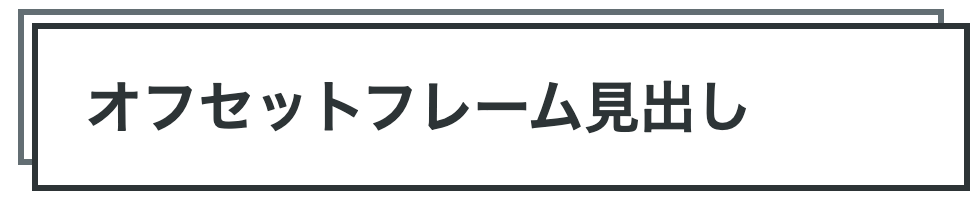
二重の枠をずらして配置し、ポスターのような視覚的な深みを創出しています。グラフィカルでアーティスティックな雰囲気を演出します。
<h2 class="stylish-heading-7">オフセットフレーム見出し</h2>.stylish-heading-7 {
font-size: 28px;
font-weight: 700;
color: #2d3436;
padding: 18px 24px;
border: 3px solid #2d3436;
position: relative;
margin: 15px 0 15px 15px;
background-color: #ffffff;
}
.stylish-heading-7::before {
content: '';
position: absolute;
top: -10px;
left: -10px;
right: 10px;
bottom: 10px;
border: 3px solid #636e72;
z-index: -1;
}9.スラッシュアクセント見出し
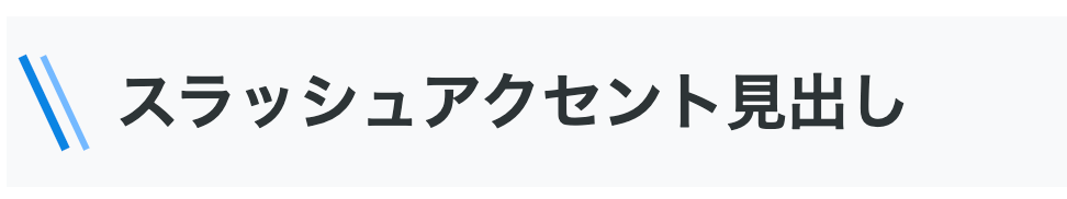
斜めのラインを複数配置し、スピード感とダイナミックさを表現しています。エネルギッシュで現代的な雰囲気を演出します。
<h2 class="stylish-heading-8">スラッシュアクセント見出し</h2>.stylish-heading-8 {
font-size: 28px;
font-weight: 700;
color: #2d3436;
padding: 18px 24px 18px 50px;
position: relative;
background-color: #f8f9fa;
}
.stylish-heading-8::before {
content: '';
position: absolute;
left: 15px;
top: 20%;
width: 4px;
height: 60%;
background-color: #0984e3;
transform: rotate(-25deg);
}
.stylish-heading-8::after {
content: '';
position: absolute;
left: 25px;
top: 20%;
width: 3px;
height: 60%;
background-color: #74b9ff;
transform: rotate(-25deg);
}10.インバーテッドコーナー見出し
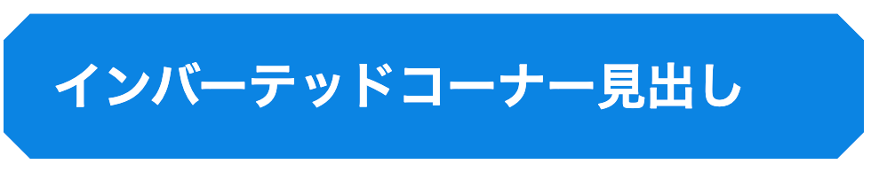
四隅を内側に切り込んだような形状で、幾何学的な個性を演出しています。モダンでシャープな印象を与えます。
<h2 class="stylish-heading-8">インバーテッドコーナー見出し</h2>.stylish-heading-8 {
font-size: 28px;
font-weight: 700;
color: #2d3436;
padding: 20px 28px;
background-color: #0984e3;
color: #ffffff;
position: relative;
clip-path: polygon(
15px 0%,
calc(100% - 15px) 0%,
100% 15px,
100% calc(100% - 15px),
calc(100% - 15px) 100%,
15px 100%,
0% calc(100% - 15px),
0% 15px
);
}⑤アイコン付きの見出しデザイン
ここでは、アイコン付きの見出しデザインを8つ紹介します。
1.サークルアイコンバッジ見出し
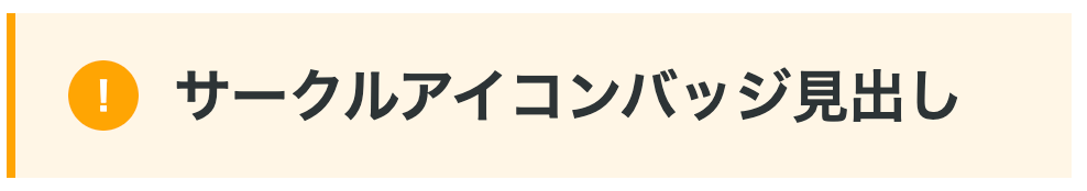
円形のバッジ内にアイコンを配置し、プロフェッショナルな雰囲気を演出しています。情報の重要度を視覚的に示せます。
<h2 class="icon-heading-1"><span class="icon-badge">!</span>サークルアイコンバッジ見出し</h2>.icon-heading-1 {
font-size: 26px;
font-weight: 600;
color: #2d3436;
padding: 18px 24px;
background-color: #fff5e6;
border-left: 4px solid #ffa500;
display: flex;
align-items: center;
gap: 16px;
}
.icon-heading-1 .icon-badge {
display: inline-flex;
align-items: center;
justify-content: center;
width: 32px;
height: 32px;
background-color: #ffa500;
color: #ffffff;
border-radius: 50%;
font-size: 18px;
font-weight: 700;
flex-shrink: 0;
}2.ヘキサゴンアイコン見出し
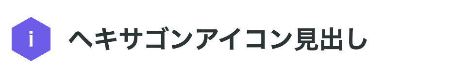
六角形のアイコンフレームを使用し、ハニカム構造のような先進的なデザインを実現しています。テック系コンテンツに適合します。
<h2 class="icon-heading-2"><span class="icon-hex">i</span>ヘキサゴンアイコン見出し</h2>.icon-heading-2 {
font-size: 26px;
font-weight: 600;
color: #2d3436;
padding: 18px 24px 18px 70px;
position: relative;
}
.icon-heading-2 .icon-hex {
position: absolute;
left: 12px;
top: 50%;
transform: translateY(-50%);
width: 40px;
height: 46px;
background-color: #6c5ce7;
color: #ffffff;
display: flex;
align-items: center;
justify-content: center;
font-size: 20px;
font-weight: 700;
clip-path: polygon(50% 0%, 100% 25%, 100% 75%, 50% 100%, 0% 75%, 0% 25%);
}3.ナンバリングタグ見出し

数字をタグのように配置し、順序や階層を明確に示しています。ステップ解説やランキングコンテンツに効果的です。
<h2 class="icon-heading-3"><span class="num-tag">01</span>ナンバリングタグ見出し</h2>.icon-heading-3 {
font-size: 26px;
font-weight: 600;
color: #2d3436;
padding: 18px 24px 18px 80px;
background-color: #f8f9fa;
position: relative;
border-radius: 6px;
}
.icon-heading-3 .num-tag {
position: absolute;
left: 0;
top: 0;
bottom: 0;
width: 60px;
background-color: #00b894;
color: #ffffff;
display: flex;
align-items: center;
justify-content: center;
font-size: 22px;
font-weight: 900;
border-radius: 6px 0 0 6px;
}4.リボンラベル見出し
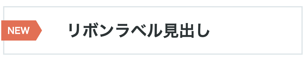
斜めにカットされたリボン型のラベルを配置し、注目を集める構造になっています。キャンペーンや重要告知に適しています。
<h2 class="icon-heading-4"><span class="ribbon-label">NEW</span>リボンラベル見出し</h2>.icon-heading-4 {
font-size: 26px;
font-weight: 600;
color: #2d3436;
padding: 18px 24px 18px 100px;
position: relative;
background-color: #ffffff;
border: 2px solid #dfe6e9;
}
.icon-heading-4 .ribbon-label {
position: absolute;
left: -5px;
top: 50%;
transform: translateY(-50%);
background-color: #e17055;
color: #ffffff;
padding: 6px 20px 6px 10px;
font-size: 14px;
font-weight: 700;
clip-path: polygon(0% 0%, 85% 0%, 100% 50%, 85% 100%, 0% 100%);
}5.フラッグマーカー見出し

旗のようなマーカーを左上に配置し、重要度や特別感を視覚化しています。見出しの階層を示すのに効果的です。
<h2 class="icon-heading-5"><span class="flag-marker">★</span>フラッグマーカー見出し</h2>.icon-heading-5 {
font-size: 26px;
font-weight: 600;
color: #2d3436;
padding: 28px 24px 18px 24px;
background-color: #fff9e6;
position: relative;
border-radius: 0 6px 6px 6px;
margin-top: 15px;
}
.icon-heading-5 .flag-marker {
position: absolute;
left: 0;
top: -15px;
background-color: #fdcb6e;
color: #2d3436;
padding: 8px 16px 20px 16px;
font-size: 16px;
font-weight: 700;
border-radius: 4px 4px 0 0;
clip-path: polygon(0% 0%, 100% 0%, 100% 100%, 50% 85%, 0% 100%);
}6.ピルバッジ見出し
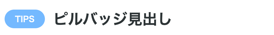
楕円形のバッジをテキストの前に配置し、カジュアルで親しみやすい雰囲気を演出しています。カテゴリー表示に最適です。
<h2 class="icon-heading-6"><span class="pill-badge">TIPS</span>ピルバッジ見出し</h2>.icon-heading-6 {
font-size: 26px;
font-weight: 600;
color: #2d3436;
padding: 18px 0;
display: flex;
align-items: center;
gap: 14px;
}
.icon-heading-6 .pill-badge {
background-color: #74b9ff;
color: #ffffff;
padding: 6px 18px;
font-size: 14px;
font-weight: 700;
border-radius: 20px;
text-transform: uppercase;
}7.クリップマーク見出し
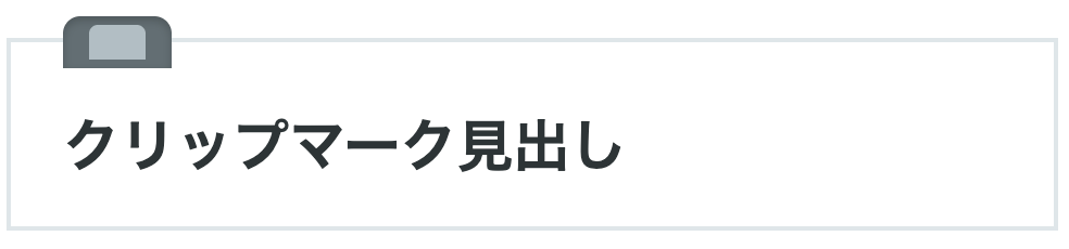
紙を留めるクリップのような装飾を上部に配置し、ドキュメント風の雰囲気を演出しています。ビジネス文書やレポートに適します。
<h2 class="icon-heading-7">クリップマーク見出し</h2>.icon-heading-7 {
font-size: 26px;
font-weight: 600;
color: #2d3436;
padding: 28px 24px 18px 24px;
background-color: #ffffff;
border: 2px solid #dfe6e9;
position: relative;
margin-top: 20px;
}
.icon-heading-7::before {
content: '';
position: absolute;
left: 24px;
top: -12px;
width: 50px;
height: 24px;
background-color: #636e72;
border-radius: 8px 8px 0 0;
box-shadow: inset 0 2px 4px rgba(0, 0, 0, 0.2);
}
.icon-heading-7::after {
content: '';
position: absolute;
left: 36px;
top: -8px;
width: 26px;
height: 16px;
background-color: #b2bec3;
border-radius: 4px 4px 0 0;
}8.スタンプ風アイコン見出し
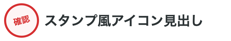
判子を押したようなスタンプ風のアイコンを配置し、公式感や重要性を表現しています。認証や承認を示すコンテンツに効果的です。
<h2 class="icon-heading-8"><span class="stamp-icon">確認</span>スタンプ風アイコン見出し</h2>.icon-heading-8 {
font-size: 26px;
font-weight: 600;
color: #2d3436;
padding: 18px 24px 18px 90px;
position: relative;
}
.icon-heading-8 .stamp-icon {
position: absolute;
left: 12px;
top: 50%;
transform: translateY(-50%) rotate(-15deg);
width: 60px;
height: 60px;
border: 4px solid #d63031;
border-radius: 50%;
color: #d63031;
display: flex;
align-items: center;
justify-content: center;
font-size: 16px;
font-weight: 900;
background-color: rgba(214, 48, 49, 0.05);
}まとめ
以上、見出しタグの正しい使い方から、実際にコピペで使える50種類のデザインパターンまでを紹介してきました。
見出しは、HTMLの構造を整えるための基本要素であると同時に、読者の目を引きコンテンツの理解を助ける重要なデザイン要素でもあります。
今回紹介したコードを参考に、ぜひあなたのサイトに合った見出しデザインを取り入れてみてください。
もし「見出しデザインをもっと自在に扱えるようになりたい」「HTML/CSSの基礎からしっかり学び直したい」と感じた方は、フロントエンドを体系的に学べるDMM WEBCAMPのフロントエンドコースもチェックしてみてはいかがでしょうか。
Web制作に必要なスキルを一通り身につけたい方にとって、実践に直結する知識を学べる環境になるでしょう。